Angels Foundation
The Angels Foundation is a charitable organization built around the principle that "Healing Loves Company." It orchestrates philanthropic events designed to activate the healing power of giving in the name of a loved one — whether in the form of time, money, or resources. They channel that generosity towards the benefit of the community and those in need.
-
Created in 2003, the Angels Foundation was originally a response to grief.
The life of a 15-year-old woman named Brittany Groover was tragically cut short in a car accident. As her family and friends grappled with the devastating loss, they sought ways to move through a torrent of emotion towards some form of meaning.
Accordingly, Groover's father and his closest friends hatched a plan to host a triathlon in Lynchburg, VA. Many of them were enthusiasts of the sport. This race had a simple purpose: to honor Brittany and her amazing life. In the midst of planning the event and interacting with all of the contestants and supporters, the family found incredible healing.
This might have been the end of the story. But that first triathlon introduced the organizers to a powerful, yet simple secret: healing loves company.
The founders couldn't escape the lesson that that first triathlon provided: in the wake of tragedy, we don't have to be alone. Healing can begin by honoring the loved ones in our lives, whether living or lost, in a public act of selflessness with friends and family. Restoring inward requires turning outward.
The Groover family and friends decided to call this epiphany the "Angel Principle." Through their associated foundation, they strive to share it with everyone.
Twenty years, two cities, and some 22 triathlon fundraising events later, the Angels Foundation continues to orchestrate philanthropic events designed to activate the healing power of giving in the name of a cherished loved one – whether through time, donations, or resources. They channel that generosity towards the benefit of the local community.
-
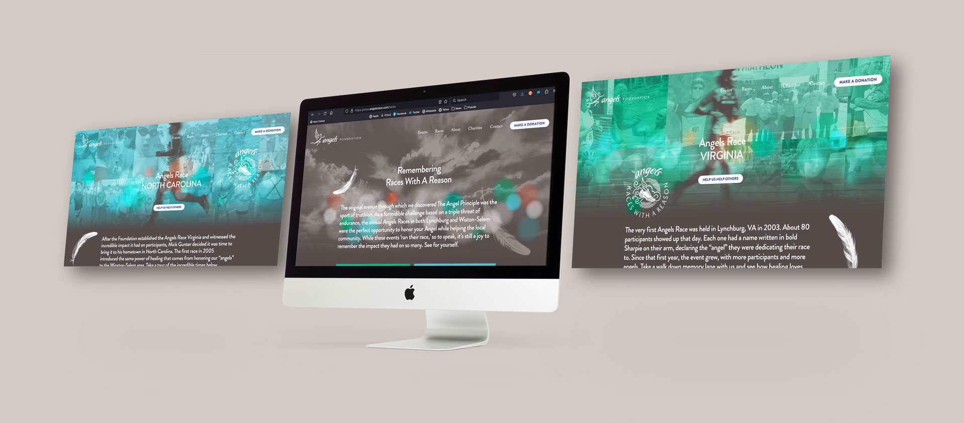
When the architects of the Angel Foundation came to the Design Office of John Murph, they had already been sharing their Angel Principle for more than 20 years. The challenge they offered was to create a new online home for the Foundation that served as both a memorial and archive of events past, as well as a framework for new donations to be delivered. The Foundation's new website would also promote and educate applicants about the assorted grants and scholarships on offer.
In conversations with the founders, it was obvious that their hearts were deeply embedded. The Angels Foundation was not just a charitable organization. It was a labor of love imbued with their grief and a framework that facilitated their healing over the years. It was critical that any solutions that The Design Office of John Murph honored these realities.
-
Using Simon Sinek's Start With Why philosophy, The Design Office of John Murph first interviewed the founders and gleaned insights on the Foundation's origin story and ongoing mission. These insights were gathered and articulated into Purpose, Mission, and Vision Statements. This groundwork uncovered what would become the brand's primary tagline: "Healing Loves Company."
We elaborated on this core statement:
"The Angels Foundation believes that, in the wake of tragedy or trauma, we don’t have to be alone. Healing can begin by honoring the loved ones in your life, whether living or lost, in a public act of selflessness with friends and family.
We believe that healing requires you to open yourself and share - publicly claiming and memorializing your love for another in the midst of your peers with a generous act of selflessness.
It’s a strange paradox we’ve discovered: restoring inward requires turning outward.
Stepping outside ourselves in the midst of inner pain requires great courage. But The Angels Foundation believes it is essential.
By focusing outward, with a passion dedicated to the service of others – all in the name of the angels in our lives - we restore ourselves." -
In addition to composing a written narrative that highlights the Foundation's powerful story, the Office created a graphic language that visualizes the Angel Principle.
This includes sepia tones that evoke old photography and nostalgia, juxtaposed with vibrant accent colors leveraged to highlight key information.
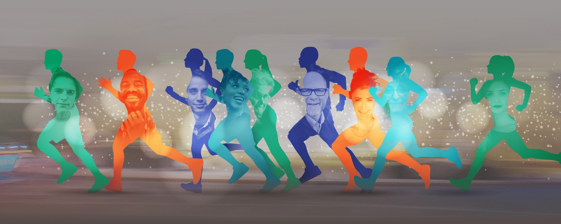
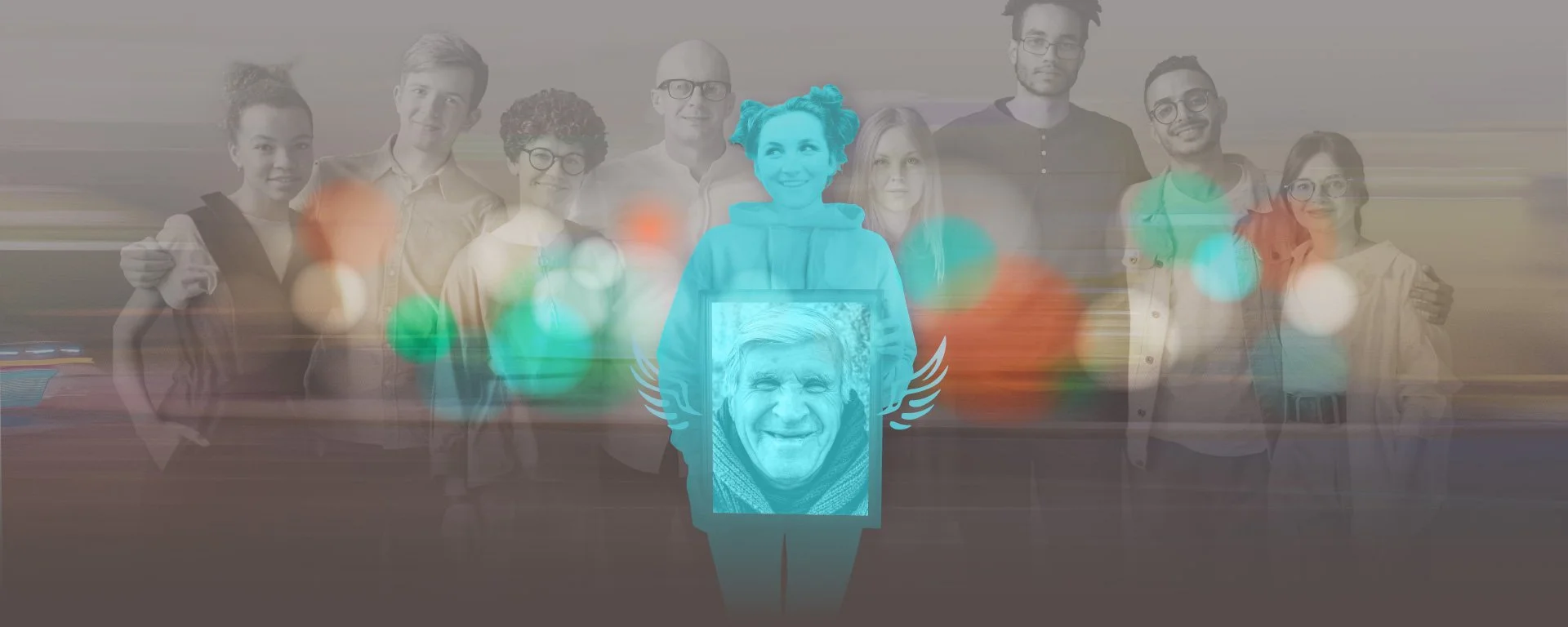
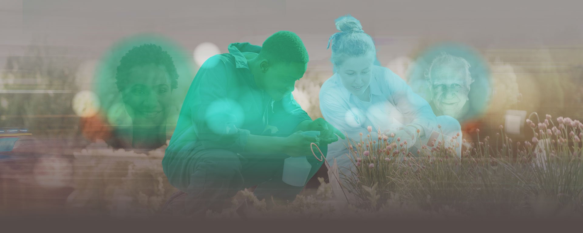
Building around an original "Angel" mark with powerful sentimental meaning to the founders, the new brand also featured imagery compiled in a sort of magical realism, blending cloudscapes with drifting feathers, iridescent sparkles, and compelling portraits. These images are compositions that illustrate the essence of the brand's position: that therapy and healing can come alongside challenge and charity.
The primary visuals serving as hero imagery for the site were visual compositions that turned individual competitors into window silhouettes. Through each window, the smiling face of the loved one being honored shown through. Their efforts in the Foundation's triathlon events enabled participants to establish a visceral connection with their loved ones. The graphics sought to illustrate this.
On the website, the new brand design served as a frame for the Foundation's vast library of photos, taken from the assorted triathlon events held over the years. Heartwarming portraits of participants were showcased, both in stand alone galleries and in collaged backgrounds. Almost to a shot, each image portrays the Angel Principle in action. Some candid shots revealed the festive, supportive nature of the events, while others revealed participants overwhelmed by emotion at the thought of honoring their loved ones.
-
One of the key features of the website was an archive of the 22 separate events held over the years. For each event, a synopsis is offered, including the original date, a general recap, a roster of the winners, any published articles related to the event, and a collection of photos taken on site at the time. Each entry also included notable quotes recorded on the day of, from participants and their families sharing how the event effected them.
This archive served as a beautiful history of the founders' efforts, and provided an opportunity to recall and reminisce about each year.
-
All of the founders' original objectives were accomplished with the final rebranding website design. The Angel Principle was re-articulated and preserved for a new generation. An archive of the many triathlon events organized by the Foundation was established. A presentation of the Foundation's grants and scholarships was achieved, and a conduit for newcomers to the Angel Principle was created.
Brand Strategy | Copywriting | Website Design


The Design Office Of John Murph came alongside the Angels Foundation to help in crafting a renewal, establishing a new brand story and updating their online presence.
In addition to composing a written narrative that highlights the Foundation's powerful story, the Office created a graphic language that visualizes the Angel Principle.
This includes sepia tones that evoke old photography and nostalgia, juxtaposed with vibrant accent colors leveraged to highlight key information.
Building around an original "Angel" mark with powerful sentimental meaning to the founders, the new brand also featured imagery compiled in a sort of magical realism, blending cloudscapes with drifting feathers, iridescent sparkles, and compelling portraits. These images are compositions that illustrate the essence of the brand's position: that therapy and healing can come alongside challenge and charity.