
Big Anchor
Started as a small father-and-son business in the early 2010's, Big Anchor Roofing has grown into a regional contractor providing roofing and gutter installation services throughout the North Carolina Piedmont. They approach every project as if it's the only one on their docket, as part of a philosophy committed to building with integrity earned one job at a time.
-
Big Anchor represents an admirable refrain in the American marketplace. It was started as a small business by Fredy Alvarez out of the back of his pickup. With a lot of hard work and sweat equity, it has evolved into a consistent business that employs multiple teams staffed to respond to contracts all over the Piedmont. Mr. Alvarez continues to work with his hands on site with one of the teams while his son, Joshue, has taken over management and sales operations.
A savvy, articulate businessman, the younger Alvarez is well aware of the need for effective branding. That being said, the company had been limited to date in pursuing a comprehensive branding strategy. This was mainly due to the realities faced by scrappy small businesses like Big Anchor: limited budget, resources, and time. By the sheer force of consistent hard work, the company had reached a point where they were able to approach their brand position more thoughtfully.
-
It's rare that The Design Office of John Murph has the opportunity to work with a trade-oriented business like Big Anchor. It's unfortunate, because scrappy small businesses like the roofing company are inherently endearing. It's one of our favorite types of clients.
The roofing business is surprisingly competitive. Local businesses live and die on Google search results, the engineering of which requires a technical expertise typically outside the purview of trade experts that often rely on do-it-yourself marketing efforts.
Also, the competition ranges across a wild range of profiles. This includes huge, state-wide businesses like Skywalker Roofing with an in-house marketing department, but also encompasses blue collar weekend warriors chasing a side hustle relying on word of mouth and a willingness to work for discounted pricing.
The need for a striking brand design was a given, but Big Anchor would also need a brand story and corporate communications optimized for often shifting and fickle search engine results.
Another variable in Big Anchor's challenge was a stipulation that they retain their existing logo, which was unfortunately drawn from a crowd sourced clip art library. It did not feature a design that balanced the principles associated with good logos: simple, memorable, and UNIQUE.
-
In reviewing Big Anchor's biggest competitors, The Design Office noted a pervasive monotony and lack of personality characterizing their branding. Leveraging Marty Neuemeier's principle of "radical differentiation," we planned to draw a clear distinction between Big Anchor and the rest of the field. This would be accomplished with both dynamic design and a bold brand voice.
-
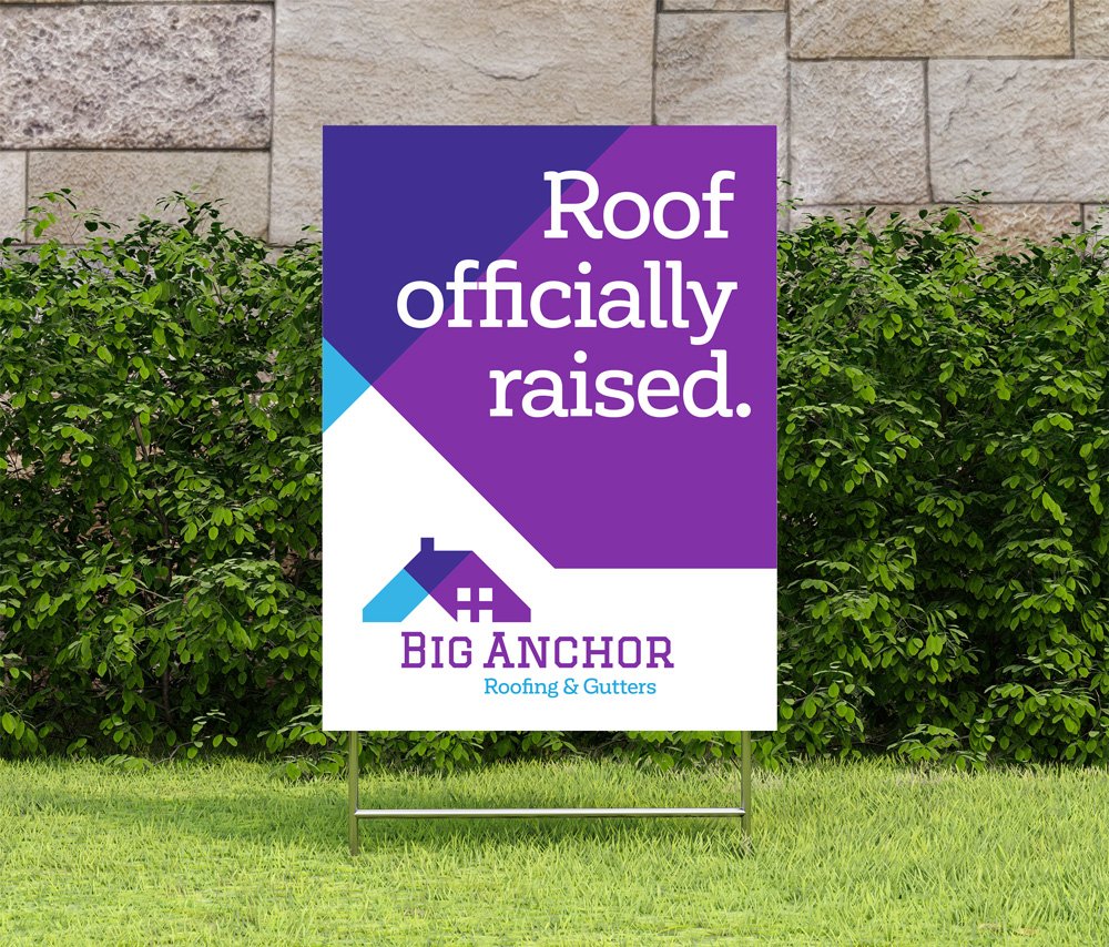
The Design Office Of John Murph proposed a branding architecture that leveraged a vibrant purple and cyan color story along with dynamic graphics to engage and establish distinction with customers. In a competitive context typically marketed with muted green and blue tones and amateur photography, the new architecture stood out.
In light of Big Anchor's affinity with their original logo, The Design Office proposed an updated variant composing a recreation of the art with a new interplay of color transparency. The bold diagonal color bars that constituted the updated logo served as a key design accent elsewhere, often forming a grid element in promotional layouts.
Coupled with this design language was a tone of voice that invoked humor and playful wordsmithing. This included alliterative statements like "Grief-free Gutters" and "Worry-free Roofs." Other brand language included "Gutters Good to Go" and "Roof Officially Raised" for signs left behind at completed work sites. A series of playful phrases were designed into the uniform shirts that staff members wore on site, such as "Your gutters gotta go," "Singles Under My Shoes," "Gutter Brain," and "Roof Raiser."
The branding was extended to a signature Satisfaction Guaranteed claim boasted by Big Anchor. It revolved around a commitment to keep working on a given project until the customer was completely satisfied. This promise was visualized with a special seal appearing as an accent in Big Anchor's promotional materials. It was heralded with the assurance, "The Seal Means We're For Real."
-
The Design Office’s collaboration with Big Anchor included the creation of a website powered by an extensive series of regionally focused landing pages, each armed with SEO refinement to capture online searches. Garnering the attention of potential customers searching Google for contractors is critical for small trade businesses like Big Anchor. It's a surprisingly competitive field.
-
With a new brand and the roll out of a robust website engineered for SEO capture, Big Anchor was ready to move into a new stage of growth. The brand's design and personality clearly stood out in a crowded field.
Brand Strategy | Logo Update | Print | Web Design | SEO | Copywriting


The Design Office Of John Murph proposed a branding architecture that leveraged a vibrant color story (atypical for the industry) and dynamic graphics to engage and establish distinction with customers.


The Design Office’s collaboration with Big Anchor included the creation of a website powered by an extensive series of regionally focused landing pages, each armed with SEO refinement to capture online searches. Garnering the attention of potential customers searching Google for contractors is critical for small trade businesses like Big Anchor.