
Ukraine’s Tryzub Travails
Has anyone noticed how elegant Ukraine’s national symbol is?
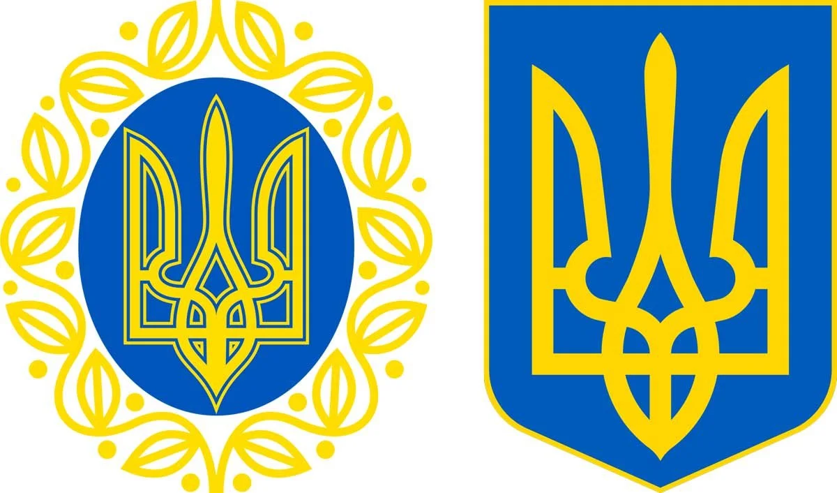
The original 1918 design by Vasyl Krychevsky, alongside its modern 1992 descendent
It usually appears in the background of grim news coverage—embroidered on uniforms, stamped on podiums, hovering behind President Zelensky as he delivers yet another address in his now-iconic black or military-green ensemble (occasionally interrupted by an obligatory White House suit). The symbol shows up with such consistency and confidence that it almost feels less like a state emblem and more like a fashion mark (with a very serious geopolitical mission).
As a brand designer—and a bit of a design nerd—I found myself wondering: why does this thing work so well? Where did it come from?
A Symbol Older Than Branding (and Still Better at It)
The Ukrainian national emblem, officially known as the Tryzub (literally “trident”), feels timeless. I had long assumed it was a relatively modern creation—perhaps something devised in the 1990s after the fall of the Soviet Union. Turns out that’s only part of the story.
In reality, its lineage stretches far deeper.
Variants of the Tryzub can be traced back to at least the late 10th century, when it appeared on seals used by envoys of Prince Ihor of Kyivan Rus in treaties with the Byzantine Empire. Some scholars suggest even earlier origins, possibly as far back as 400–300 BC. Members of the ruling Rurik dynasty (spanning from 879 to 1598 AD) each employed their own modified versions, resulting in more than 200 recorded variations. The most famous of these belonged to Volodymyr the Great.
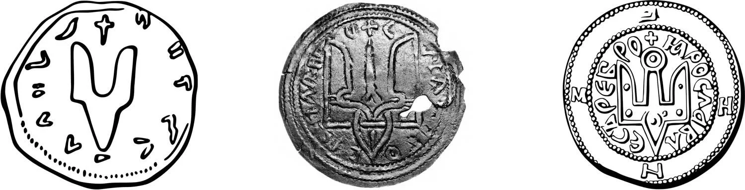
Keeping it all in the family (from left to right): the Seal of Sviatoslav the Brave (945 AD), a coin of his son, Volodymyr the Great (980 AD), and a coin of HIS son, Yaroslav the Wise (1019 AD)
As medieval politics shifted—as they so often did—the symbol fell out of common use. It resurfaced in 1917, just in time to serve as the emblem of the newly formed Ukrainian People’s Republic emerging from the collapse of the Russian Empire. The Tryzub was printed on currency, adopted as the coat of arms by the Central Rada (parliament), and formally described as “the sign of the Kyiv State of the times of Volodymyr the Holy.” By the way, attributing the word “holy” to Volodymyr is . . . interesting, as I’ll elaborate. The modernized version was designed in 1918 by Vasyl Krychevsky, a noted artist, scholar, and architect.
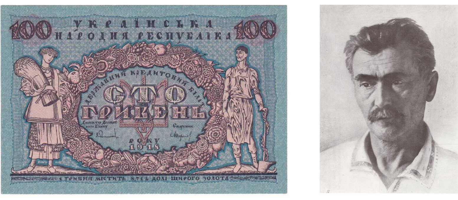
A 1918 Ukrainian ‘100 Hryvnya’ note, alongside the Tryzub’s modernizer, Vasyl Krychevsky
That revival was short-lived. By 1920, Soviet forces had marched through Ukraine in the midst of a spat with Poland, suppressing national identity and outlawing Ukrainian symbols in favor of the Communist hammer and sickle. The Tryzub survived primarily in exile—kept alive by the Ukrainian diaspora—until independence was finally declared in 1991. On February 19, 1992, it was reinstated as the official State Emblem of Ukraine, a date now commemorated annually.
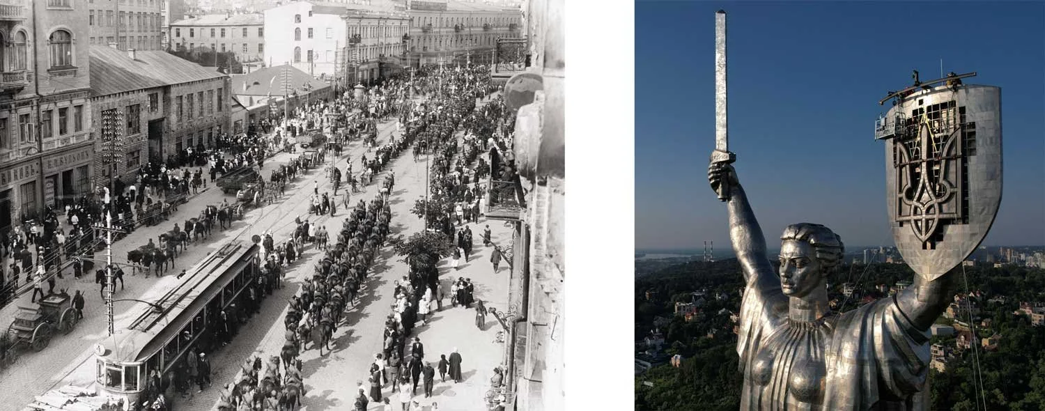
Left: Polish and Ukrainian troops gather in Kyiv before Soviets overtake the city;
Right: A Soviet-era “Motherland” monument gets its hammer & sickle icon swapped out for the Ukrainian Tryzub.
Meaning: Ambiguity by Design
Given its ancient origins, the Tryzub’s “true” meaning is a matter of ongoing debate. There are more than forty recorded interpretations.
Some see it as a symbol of dominion over three realms—heaven, earth, and the underworld. Others interpret it as a crown, a flame, or a Christian reference to the Holy Trinity. I personally long assumed it represented the Holy Spirit, often depicted as a descending dove—an interpretation complicated by the fact that Volodymyr the Great clung to paganism until he pragmatically chose Byzantine Christianity for geopolitical reasons. (As historical figures go, Volodymyr radiates peak Game of Thrones energy: an illegitimate son who ultimately outmaneuvered his fully legitimate siblings.)
Another theory suggests the symbol depicts a hunting falcon in descent, possibly linked to the Slavic deity Raroh — an avian god of fire and wind.
More recently, a compelling contemporary reading has gained traction: that the Tryzub subtly contains the Cyrillic letters of the Ukrainian word ВОЛЯ (volya), meaning “will” or “freedom.”
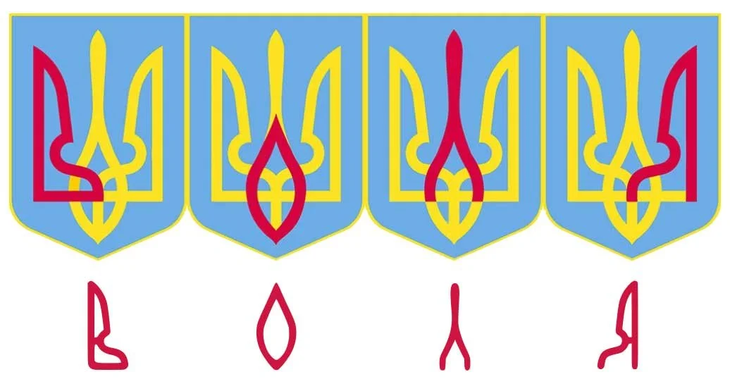
A demonstration of how the ВОЛЯ (volya) interpretation works. I mean, who knows?
This interpretation has taken on particular resonance during Russia’s ongoing invasion. In occupied territories, reports describe civilians being searched for patriotic tattoos—especially those featuring the Tryzub—with devastating consequences. Meanwhile, the symbol appears in graffiti and protest art along front lines, reclaimed as a mark of resistance. It has played similar roles before, during the Orange Revolution of 2004 and the Euromaidan protests of 2013–2014.
Meaning, in other words, has not weakened the Tryzub. It has accumulated.
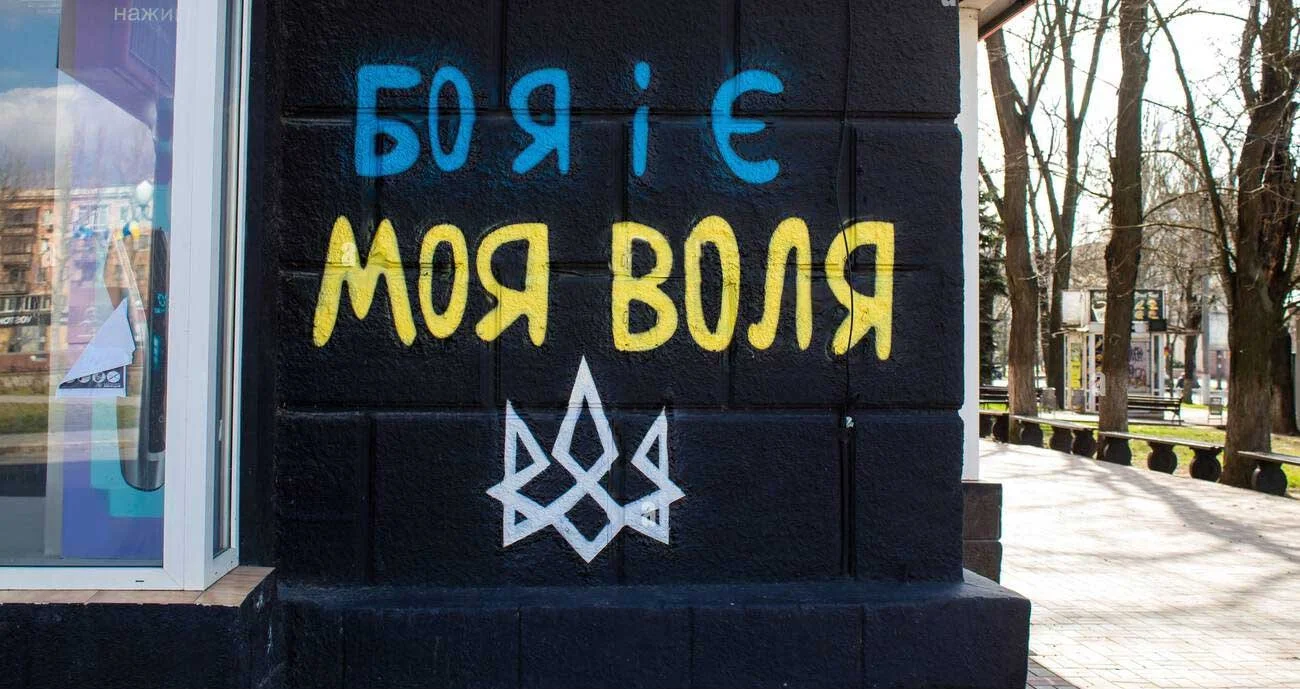
A sample of graffiti common in Russian-controlled territory in Ukraine. Note the prickly, almost thorn-like rendition of the Tryzub. It feels as though it’s composed of barbed wire.
Why the Tryzub Works (From a Design Perspective)
Stripped of history and politics, the Tryzub serendipitously remains a remarkably strong piece of graphic design.
At its core, it balances three essential qualities of effective logos: restraint, memorability, and distinction. It is abstract but not vague, structured but not rigid, symbolic without being illustrative.
Geometry & Structure
The composition is strongly axial, lending it authority and stability. Yet it doesn’t feel static. Much of the visual weight is concentrated toward the bottom, creating the sensation of downward motion—almost as if the mark is plunging from the sky (appropriate in the context of the hunting falcon/”Raroh” interpretations). That tension gives it energy. The Tryzub doesn’t sit passively; it reaches.
Despite its symmetry, the mark avoids mechanical repetition. It feels geometrically inevitable, even though it doesn’t advertise an obvious grid or construction system. The negative space is as carefully considered as the positive form, preventing the symbol from becoming dense or ornamental.
Ambiguity as a Feature
One of the Tryzub’s greatest strengths is its refusal to settle on a single, literal interpretation. This ambiguity is not a flaw—it’s a durability strategy. Symbols that explain themselves tend to age quickly. Symbols that suggest meaning tend to endure.
Scalability & Reproduction
The Tryzub excels under one of the harshest test of modern branding: scalability. It remains instantly recognizable on currency, stamps, digital icons, military insignia, and—yes—favicons. It reproduces cleanly when carved, embossed, printed, embroidered, or pixel-rendered. Even when subjected to the best (worst?) efforts of well-meaning AI prompters on social media, it largely holds together.
An assortment of examples of the Tryzub living in the wild. It appears on anything from hoodies to coins to stamps. My favorite is the 3D downloadable STL file, in which some industrious enthusiast created a Tryzub-shaped spaceship worthy of Star Wars.
Color Independence
Although most commonly rendered in gold on blue, the Tryzub does not rely on color to explain its form. It performs just as well in monochrome and survives inversion or flattening without losing identity. For a national emblem, this level of flexibility is unusually high.
In design terms, the Tryzub feels closer to Japanese mon or ancient sigils than to the layered complexity of European heraldry. It is a rare thing: a pre-modern symbol that behaves like a modern logo.
Why Other National Symbols Struggle
This inevitably raises the question: why don’t more nations have symbols that work this well?
Many European emblems—the UK’s Royal Arms, the German or Polish Eagles, the Spanish coat of arms—lean heavily on detailed, illustrative traditions. Closer to Ukraine, Slovakia’s double cross atop stylized mountains is cleaner, but still leans on pictorial storytelling rather than abstraction.
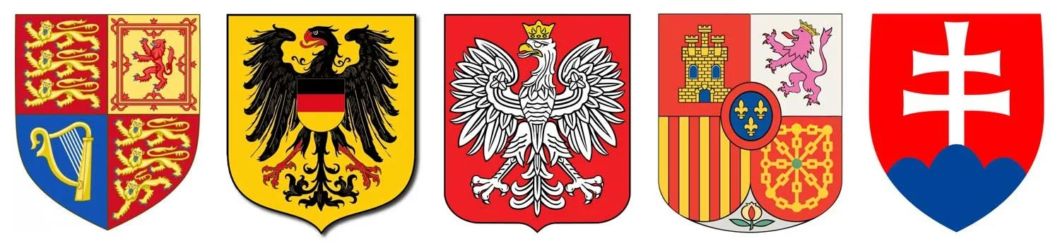
From left to right, the UK Royal Arms, as well as the German, Polish, Spanish, and Slovakian coats of arms
Internationally, the pattern repeats. The U.S. Bald Eagle, the Russian double-headed eagle, the Mexican eagle, and the Dutch lion all rely on representational illustration and lack a single, definitive mark. Biological realism invites stylistic drift. The Tryzub avoids this entirely—there is no “correct anatomy” to violate.
Stronger competitors do exist. Japan’s Rising Sun, the Canadian Maple Leaf, South Korea’s Taegeuk, the Swiss cross, and various star-based symbols share abstraction and scalability. Yet many suffer from overuse or overly literal semantics. Stars, in particular, are so ubiquitous that they struggle to establish distinction. The Taegeuk fares better, but its reliance on color and its resemblance to the yin–yang dilute its uniqueness.
Perhaps the closest peers are Japanese mon—emblems developed between the 9th and 12th centuries that identify families, institutions, and places. Some, like the Mitsubishi logo, persist almost unchanged today. Many prefectural flags in Japan still demonstrate how powerful this design language can be when applied with restraint.

The South Korean Taegeuk and Mitsubishi logo alongside an assortment of Japanese prefecture symbols.
In particular, many of the prefecture symbols are truly stunning
A Symbol System, Not a Story
Most national symbols are, at their core, stories.
They depict animals, landscapes, tools, or allegorical scenes, crafted and designed in a context of archaic technology typically. More often than not, they rely on explanation and ceremony to function. Their meaning is cumulative, but can be brittle. Remove the context, flatten the rendering, shrink the scale, change the color, or shift the medium, and much of their communicative power evaporates. They work best when treated reverently.
The Tryzub operates differently. It does not narrate. Rather, it signals. The mark does not explain meaning; it contains or embodies it. Crucially, it allows for reinterpretation without requiring redesign. The Tryzub can be stylized, abstracted, weaponized, softened, glorified, or reduced to pure silhouette, and it remains unmistakably itself (see some of the iterations in the title graphic of this post). That is an extraordinarily rare quality—especially for a national emblem. Honestly, the Tryzub’s design leverages a similar enduring flexibility to religious symbols — specifically, those of the Abrahamic faiths.
From a brand-design perspective, this is the difference between a logo that needs a brand standards guide to survive and one that enforces its own rules simply by existing. Think of the Fedex logo versus the Nike logo as an example. The Tryzub has an internal logic: axial balance, controlled negative space, a recognizable silhouette, and a geometry that feels inevitable even when distorted. These qualities allow it to live comfortably across centuries, technologies, and ideologies without collapsing into pastiche.
It also explains why the symbol feels so contemporary despite its age. Modern branding systems prize marks that can:
Scale effortlessly
Animate or fragment without losing identity
Function in monochrome
Absorb new meaning over time
Remain legible under pressure
The Tryzub does all of this—not because it was designed to, but because it was never overdesigned in the first place.
If most national symbols are fixed narratives—snapshots of a particular historical moment or concept—the Tryzub is an open framework. It doesn’t insist on what it means. It allows meaning to accrue. That quality has made it resilient through collapse, suppression, revival, and now active resistance.
In branding terms, that’s not just good design. It’s elite-level identity architecture.
If most national symbols tell stories, the Tryzub builds infrastructure. And that distinction places it among the strongest—and most instructive—marks ever created (in my humble opinion). How does one replicate this? I’m not sure what the recipe is. The typical brand identity commission doesn’t have a 1,000 year time frame. It’s fair to argue that this is all a happy accident, but the design strength is undeniable.
Regardless of the explanation, the Ukrainian Tryzub works. Exceptionally well.
Basically, it rocks. Wish I had thought of it.