
Cracker Barrel Cacophony
The pitchforks are out.
Is their branding over a barrel?
The Original Gangster versus The New Hotness
So, as you're no doubt aware, the latest news cycle is all aflutter with the rebranding of another iconic American corporation. This time, the guilty party inspiring acrimony is the country style cuisinarium, Cracker Barrel. The branderati have pulled out their pitchforks and are beating plowshares into swords. As with every public pearl clutching in these interesting times, I'm forced to ask: is there a "there" there, or is it all just "sound and fury?"
Barrels Up!
Let's set the stage: the date was Monday, August 18th. Tennessee-based Cracker Barrel served up a press release announcing their new look to world, launching "a new fall menu creative campaign that celebrates more than 55 years of country hospitality and positions the iconic American brand for the future." The update follows a preceding roll out of interior rebranding throughout the company's 660 locations.
Boasting of the new soft-cornered hexagonal logo, Cracker Barrel asserted that "Its more popular menu offerings like farm fresh scrambled eggs and buttermilk biscuits even serve as inspiration behind the hues of a refreshed color palette featured in the new campaign. Anchored in Cracker Barrel’s signature gold and brown tones, the updated visuals will appear across menus and marketing collateral, including the fifth evolution of the brand’s logo, which is now rooted even more closely to the iconic barrel shape and word mark that started it all."
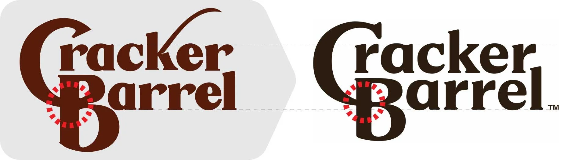
Typographical, the evolution is relatively subtle. The old logo's customized serif letterforms are reminiscent of Goldenbook Black or Qeskile Voyage Medium. They were crafted by designer Bill Holley, who received direction from founder Dan Evins to create "something nostalgic but not 'corny.'"
Holley's original work has been cleaned up for a more refined presentation and better legibility, while still maintaining the playful conjunction of the "C" and "B," along with an overall vintage feel. The typography's position within the hexagonal frame benefits from a generous margin.

Herschel and the Barrel get the boot
The more dramatic change is the design's abandonment of the gestural "pumpkin" shape enveloping the logotype in favor of the above mentioned hexagon — intended to be an abstraction of the titular barrel turned on its side. Speaking of the original barrel and Cracker Barrel's grandfatherly avatar, "Uncle Herschel," they are no longer on the menu.
The brand's style guide allows the soft, hexagonal 'barrel' to be used as a framing device beyond the logotype itself, forming part of the new brand's graphic language. This includes playful badges that tout Southern idioms as well as a monogram constituting an abbreviated trademark.
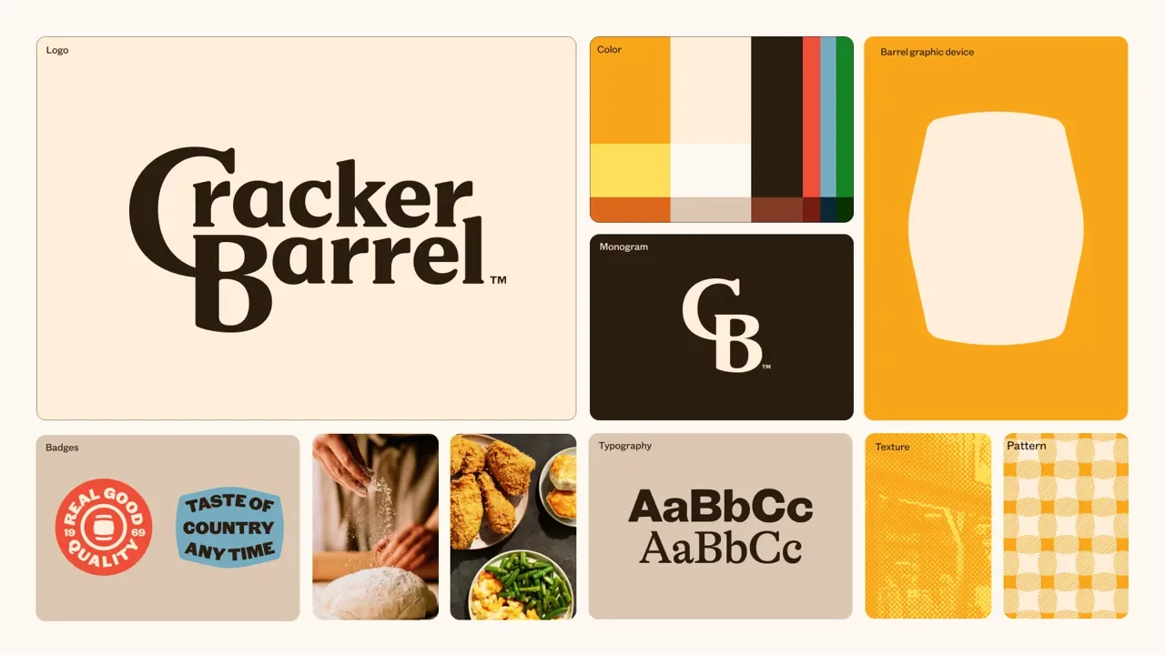
A snapshot from Cracker Barrel’s new style guide
The new logo was revealed in tandem with the company's "All the More" campaign, which introduced new menu offerings alongside the brand update, and featured a collaboration with country music star Jordan Davis. This continues a history of partnerships with country music celebrities, ranging from Dolly Parton and Loretta Lynn to Trisha Yearwood and the Oak Ridge Boys.
It's a "perfectly fine brand refresh," as declared by Rudy Sanchez of The Dieline. Honestly, I have to agree. I would be proud to have designed this system. The style guide includes delightful riffs on Southern culture, including heavy newsprint-style halftone textures and a classic Gingham pattern customized to integrate the hexagon barrel.
The People's Peanut Gallery
But that's not what the huddled masses think. The online reaction was swift. Social media churns even now, with comments ranging from "The new rebrand took the feeling away" to "I'm feeling like this new logo is ruining my life" percolating to the surface.
Pull up the brake here for a moment. Did you know that a brand design could actually ruin a person's life? I didn't. I need to leverage that on a few people.
Anyway, my personal favorite was "you can’t begrudge anybody who liked the restaurant chain from recoiling at a redesign that removes the sitting grandfatherly figure and leaves Generic Country Font Number Seven atop some half-melted Velveeta."
Even one of Cracker Barrel's competitors had to take a shot. Steak'n Shake sniped, "Heritage is what got Cracker Barrel this far, and now the CEO wants to just scrape it all away."
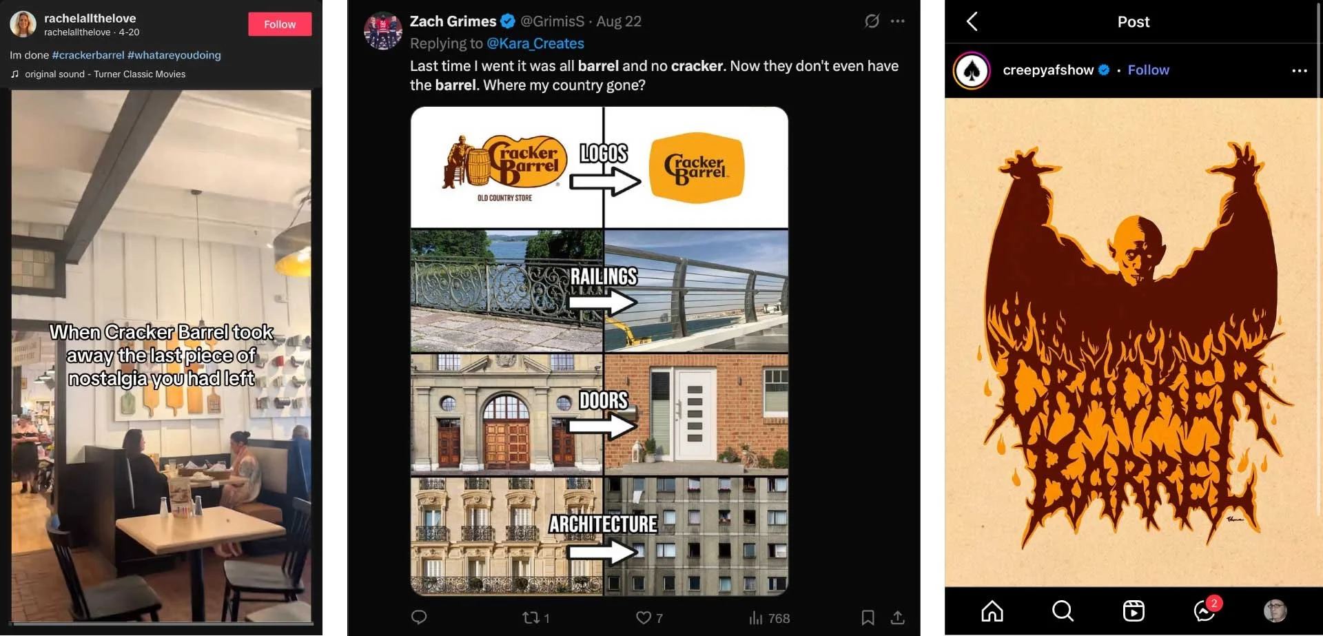
A sampling of the remonstrance; I’ve got to say, I LOVE the Salem’s Lot edition
The first shot that achieved virality actually preceded the new logo, focusing more on the updated retail environment. Rachel Love, a 38-year-old Tennessee resident and self-proclaimed Cracker Barrel fan, dropped a TikTok video captioned "When Cracker Barrel took away the last piece of nostalgia you had left." In the wobbly video, you get a quick glimpse of the new interior. It's significantly brighter than the original, but still features many of the same characteristics. Most prominent are new white board & batten walls consistent with rural Southern architecture. It's difficult to tell, but the original store design's chaotic presentation of antiquities crammed into every square inch of available space has been replaced. Instead are clean canvasses(?) with the same antiquities organized and arranged in playful grid configurations.
Ms. Love's post caught the TikTok tide, and was followed by a cacophony of protest. When the new logo was released, the reaction reached meltdown. Standouts include "This seems almost like intentional sabotage. No one wants a minimalist Cracker Barrel. We want Hoarders: Southern Grandma Edition. If it don’t look like Meemaw and Peepaw’s, with the only concession to modernity is removing ashtrays, I’m out."
But my favorite so far was "the point of going to Cracker Barrel is like you're going to Grandma's. Now it's like you're going to her nursing home."
The outcry was loud enough to prompt the company's CEO, Julie Felss Masino to appear on Good Morning America on Tuesday the 19th to attempt to placate the mob. She insisted that "the feedback has been overwhelmingly positive," from both guests and team members.

Cracker Barrel CEO Julie Felss Masino makes her case on Good Morning America
I've heard of pork-barrel politics, but . . .
Strangely enough, the protest moved into the political realm (like everything else). At first, shouting seemed to be coming from the right. Leftward Daily Beast declared "MAGA Loses It Over New Cracker Barrel Logo." To be fair, conservative pundits from Ben Shapiro to the National Review were definitely weighting in. Even Donald Trump Jr. felt the need to comment with the sage words, "WTF is wrong with @CrackerBarrel??!"
I suppose this makes sense. As Jim Geraghty of National Review points out, "People are resistant to change in general, but it is understandable that they’re particularly resistant to change in a restaurant chain whose appeal has always included an element of nostalgia. And perhaps there is an ideological or sensibility aspect to the reactions; the people who are most inclined to dislike sudden drastic changes are the ones inclined to try to conserve things they like."
But just when you think it can be dismissed as MAGAnaut weeping and gnashing (The Daily Beast certainly did), California governor and 2028 presidential hopeful Gavin Newsome shouted 'hold my beer!' His X post declared, "WHAT IS WRONG WITH CRACKER BARREL?? KEEP YOUR BEAUTIFUL LOGO!!! THE NEW ONE LOOKS LIKE CHEAP VELVEETA “CHEESE” FROM WALMART, THE PLACE FOR “GROCERIES” (AN OLD FASHIONED TERM)!!! "FIX IT” ASAP! WOKE IS DEAD!! THANK YOU FOR YOUR ATTENTION TO THIS MATTER. — GCN."
It's possible that Gov. Newsome is rendering this post in sarcastic jest, as part of his odd new strategy of mocking President Trump by emulating his eloquent writing style, complete with all-caps fervor.
But then the online personification of his party, @TheDemocrats, joined the fray to insist "We think the Cracker Barrel rebrand sucks too."
Yes, Cracker Barrel has taken one for the team in order to bring the country together. It's beautiful. Patriotic, even.
All the criticism has manifested into real pain, with shares in Cracker Barrel plunging 12% as of August 22, shedding $100 million in market value. I'm really, REALLY glad my name isn't Julie Felss Masino.

A sampling of X posts serving up bi-partisan barrel-based politics
A brand is as a brand does
So what's a brand to do? At this point, I'm guessing that Cracker Barrel's C-Suite will try to ride out the storm. After all, they've invested some $700 million into the current rebranding effort. The real test will be in the months ahead: can Cracker Barrel hold on to its heritage while still winning over diners in today’s crowded restaurant market?
The debate about how far to go with an overdue branding update (Cracker Barrel was at 50 years and counting) has always been tenuous. Balancing the need to connect the past with the present (and future) against the danger of erasing legacy — and knowing where the event horizon is — is not for the faint of heart.
Misfires include luminary brands like Tropicana (2009), Kraft (2009), The Gap (2010), American Airlines (2013), and Jaguar (2024). However, there are successes as well: Apple, Starbucks, Google, and Instagram.
As stated above, I really don't think Cracker Barrel's update is a poor design.
I'm not alone in that opinion. Allan Peters, the Minneapolis-based man of the hour in the brand design industry, was interviewed on CNN. He offered, "I think strategically they did everything right. From their perspective, their audience is getting older. They're in their 70's and 80's and [Cracker Barrel is] trying to attract a younger audience." Peters also rightly observed that logos of today must survive in a variety of contexts, not least of which are smart phones as an app logo. Cracker Barrel's original mark would have been hard pressed to register in such an environment.
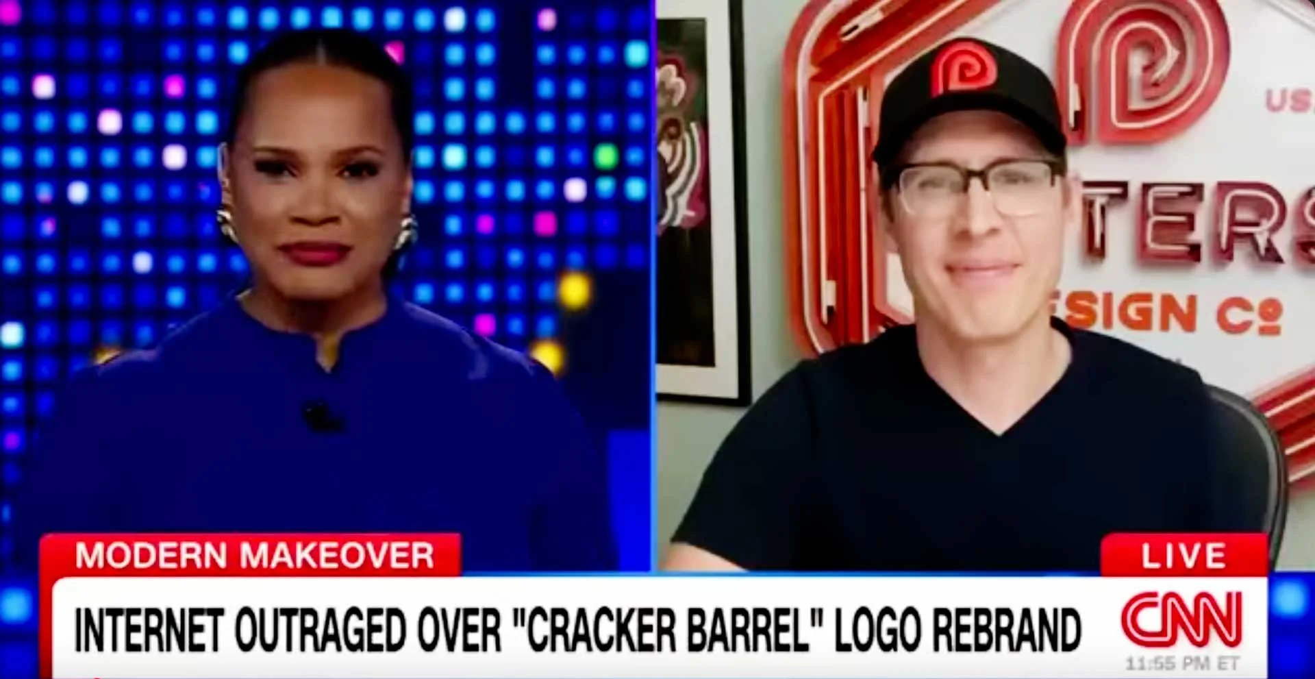
Peters prognosticates about whether the Cracker Barrel logo is all its cracked up to be
Maybe the pace of change was a bit too abrupt. Many of the success stories listed above have gradual change in common, with slow, deliberate steps taken over a span of years. But sometimes a brand's strategy necessitates something more dramatic. Shifting from Baby Boomers to Millennials and Gen Z is no small feat. As Peters pointed out, "to hit a different target audience, they needed to make a big change." Consider IHOP, another iconic restaurant brand. IHOP retained their core typography, but freed it from its old retainer. The red downward arc housing "Restaurant" was flipped into a smile, personifying the letterforms above.
Herschel, hold my beer . . .
For the sake of argument, let's explore some possibilities. Perhaps the update should have carried forward the pumpkin-shaped frame instead of the hexagonal barrel. This sort of works, and follows the rule of gradual change more closely while stepping towards a simpler design. Herschel and the barrel could still appear in other branded materials. That being said, the shape just isn't nearly as pliable as the hexagonal barrel.
Perhaps the pumpkin is a better shape to house the typography?
Another option might still involve leveraging the barrel as a framing device, but rendering it in a style more reminiscent of the original. This could be paired with an updated illustration of "Old Herschel," allowing him to become part of the brand in the same way that The Colonel does for KFC. His removal has been one of the chief complaints of the mob.
What if we ditch the pumpkin and maintain the old school illustration style?
I’m hesitate to even share the result. The problem is that this solution runs afoul of the challenges that Peters mentioned. This mark is as visually complex as the original, and would not translate to modern contexts like smart phones without creating simplified variants (which lead us right back to where the actual new logo is).
Neither of these solutions has the flexibility that Cracker Barrel's new logo achieves. It's just a fact. A logo is not a brand, as Marty Neuemeier so astutely pointed out. For the most part the designers stuck the landing by creating a logo that paid homage to its legacy (particularly with the typography) while setting the stage to appeal to a new generation of customers. People need to put down their pitchforks. But nostalgia is a powerful drug. Godspeed to Cracker Barrel.