
Krispy Kreme Store Interior Design
Krispy Kreme constitutes one of the most revered brands of America, particularly in the South. It boasts a long heritage of evoking warm, delicious memories since 1937. It boasts a commitment to making "life a little sweeter, one delicious bite at a time."
-
In the late 2000's, Krispy Kreme was moving into rough seas as a brand. The optimism that fueled its growth in the 1990's had faded, and franchisees were beginning to rebel over escalating costs and corporate requirements. This included bearing the weight of huge, 4,400 square foot factory stores that represented a hefty $1.7 million investment.
In this context, franchisees were scrambling to find ways to diversify their product offerings. This included a focus on soft serve ice cream in the Pacific Northwest that was branded as "Kool Kreme."
Of course, its signature offering is the immortal Original Glazed doughnut, but KKD had an established history of featuring other products on its menu. Vintage photography of lines of waiting customers running outside 1940's era stores include signs advertising ice cream. In the present, corporate leadership embraced the idea of returning to this and seeking ground in other “day parts,” or meal time associations.
The problem was how individual franchisees were going about this introduction. In the Pacific Northwest's case, the green and red Krispy Kreme logo was pulled down from outside stores and replaced with a blue "bowtie" variant repurposed with the "Kool Kreme" moniker. One can imagine the sort of recognition schizophrenia this induced in a market still relatively new to the original brand. Inside, the store interior mirrored the same clumsy rebranding with blue menu boards and signage that focused on ice cream as a priority over doughnuts.
-
In response to this dilemma and in pursuit of a more strategic, thoughtful expansion, Krispy Kreme corporate invited The Design Office Of John Murph to re-imagine the store interior environment in such a way as to allow the introduction of new offerings and menu categories without disrupting or eclipsing the consumer’s connection with the brand's main event - doughnuts, and lots of them. In this case, the new offering was the “Kool Kreme” soft serve ice cream at issue, but any solution needed to be flexible enough to balance other offerings and categories as well.
-
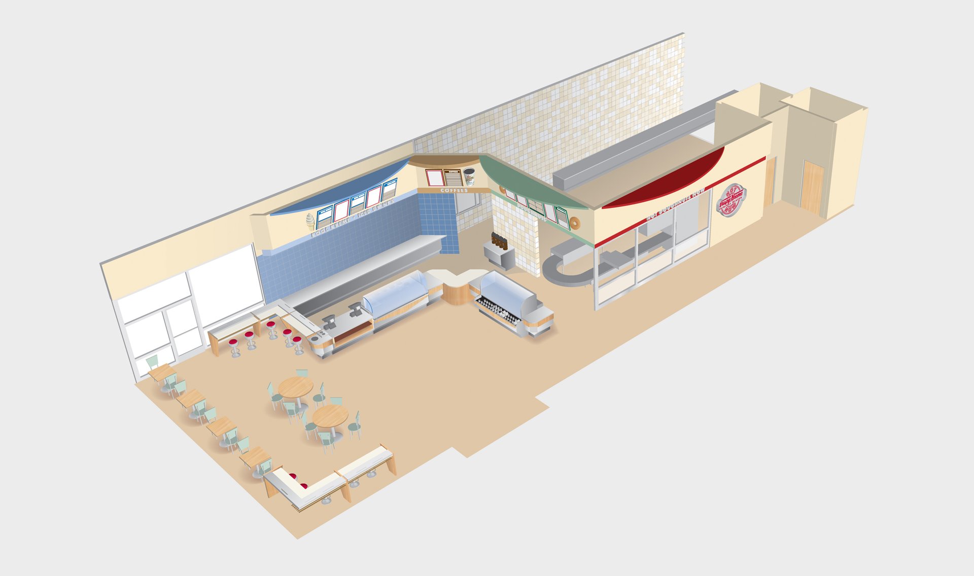
John Murph’s solution included the creation of "zones" within the retail environment, compartmentalizing KKD’s menu in an easily codifiable way. This leveraged a new modularized, multi-faceted counter configuration, a reconceptualized soffit structure, ceiling "clouds," updated menu board design, and a new color and texture differentiation between zones.
The configuration was structured so as to align the design differentiation with the actual equipment associated with each zone. For example, the "doughnut zone" was characterized by a lighter shade of Krispy Kreme's core green, and aligned with the showcase machinery associated with doughnut production. For "Kool Kreme," a corresponding blue coloration was used in proximity with the equipment centered on the soft serve ice cream.
The new strategy also provided a paradigm that could be applied to different store types, whether free-standing or housed in larger retail environments. The latter variety included examples as far reaching as Penn Station in NYC, and as close as the Carolina Panthers NFL Stadium.
-
While not technically a product category, Krispy Kreme's fabled "Doughnut Theatre" is a key aspect of its brand experience. Children and adults alike are mesmerized by the slow progression of Krispy Kreme's signature Original Glazed through the machinery's Rube Goldberg-like design.
This part of the store's interior received a special "zone" treatment, with the brand's vibrant red being assigned over the Theatre's window. With special promotions, the window was enhanced with messages and graphics that reinforced the core brand story.
-
The result was a store design that was bright and engaging, providing clarity and education to the consumer. The new zone differentiation was clearly visible, allowing visitors to easily understand the new product variety. It also allowed KKD corporate to accommodate franchisees' concerns while still preserving the integrity of the brand.
Brand Strategy | Retail Environment Architecture & Design

The Design Office Of John Murph was invited to re-imagine the store interior environment in such a way as to allow the introduction of new offerings and categories without disrupting the consumer’s connection with the main event - doughnuts, and lots of them. In this case, the new offering was a soft serve ice cream to be named “Kool Kreme.”
The Design Office’s solution included the creation of zones within the retail environment, compartmentalizing Krispy Kreme’s menu in an easily codifiable way. This leveraged a new modularized, multi-faceted counter configuration, a reconceptualized soffit structure and menu board design, and a new color and texture differentiation between zones.

The result was a store design that was bright and engaging, providing clarity and education to the consumer. The new zone differentiation was clearly visible, allowing visitors to easily understand the new product variety.


The new zone concept also provided a paradigm that could be applied to different store types, whether free-standing or housed in larger retail environments like this Penn Station location in NYC.


