Krispy Kreme Store Exterior Design
The heritage of Krispy Kreme's architecture over the years represents a truly beautiful snapshot of Americana, with an archive that ranges from Edward Hopper style and mystique to playful 1950’s kitch. A library of photography even documents some of the brand's vibrant history at the Smithsonian.
-
As Krispy Kreme came under new leadership and emerge from its travails in the late 2000's, a new interest arose in developing a franchise-wide standard methodology for upgrading existing store exteriors and building new ones. Up to this point, the brand featured a potpourri of old vintage stores, one-off prototypes with no practical follow up, and bland stucco boxes with beige trim. In the latter, more recent example's case, the architecture had no discernible branded character. Without the bowtie logo, the structure could just as easily be a CVS or local bank branch.
-
Based on the success of the interior design, The Design Office Of John Murph was invited to develop concepts for Krispy Kreme exteriors that addressed this eclectic mix.
Any design solution needed to consider several parameters, including a modularity that allowed franchisees to choose and adapt to their individual needs without sacrificing brand consistency. Concepts also needed to consider a dramatically reduced footprint to move away from the 4,400 square foot behemoths of Krispy Kreme's original expansion.
Finally, any recommendations needed to have minimal impact on the true structure of each building. A key consideration of thoughtful retailers in both renovation and new construction is to make allowance for the ultimate fate of their efforts. Inevitably, every building will reach the end of its life cycle, to be retired as the brand adapts and grows.
As a result, the structure's resale value needed to be considered. A design that is too unique becomes difficult to sell. For example, the stunning Hummer showrooms of the late 90's were incredibly designed, but their glass and steel "H" facades became an unsellable liability when the brand began to fall out of favor and fade.
-
As with the interiors, our objective was to tap into Krispy Kreme's unmistakable heritage and history. Wherever possible, modern interpretations of the brand's past would be leveraged to give the store design a distinct character. These concepts would be translated into actionable systems that were modular, impactful, and yet ultimately removable.
-
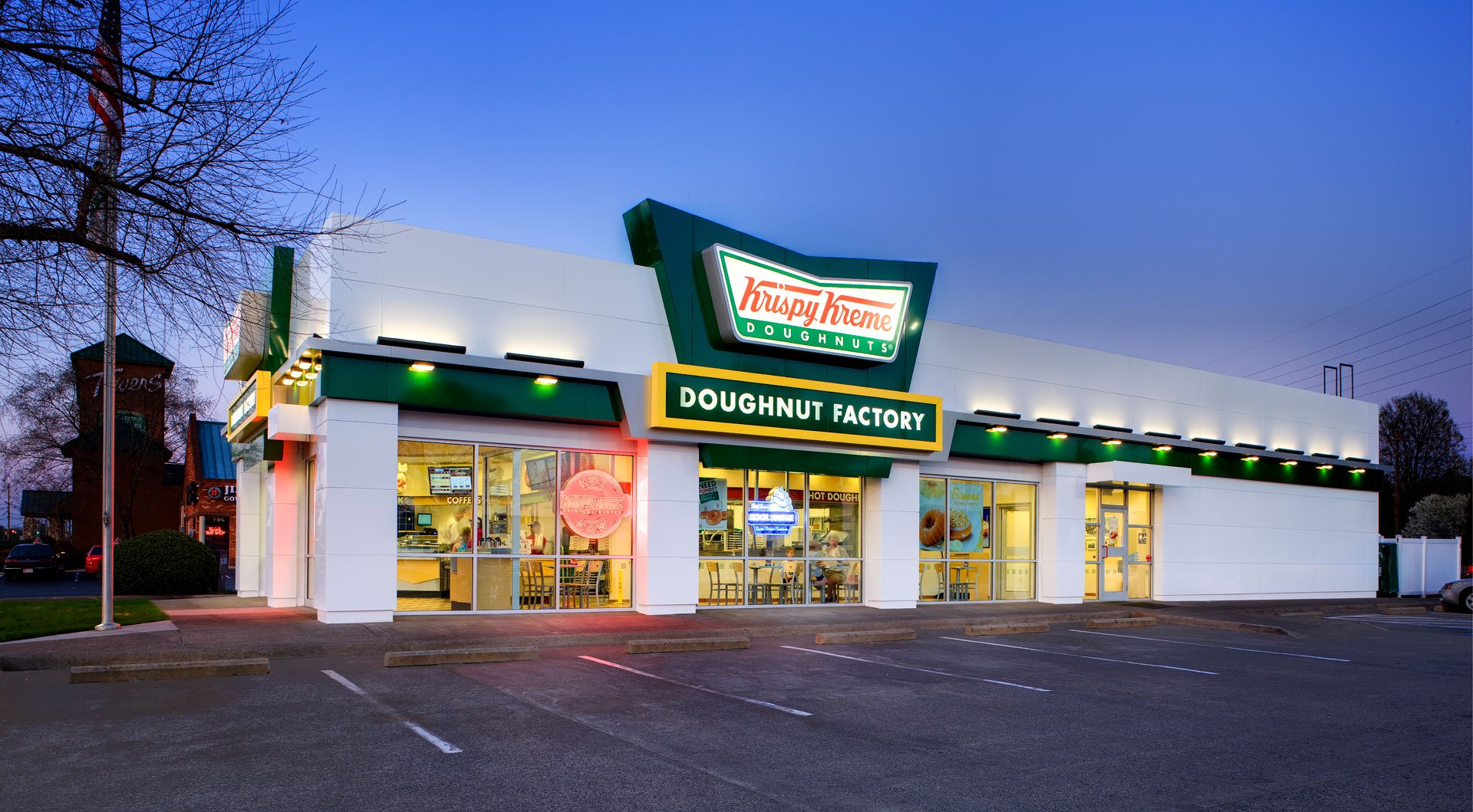
John Murph’s solution was to create an open, bright environment reminiscent of the classic coffee bar shops of earlier times. Accented with Krispy Kreme's core brand colors, the building concepts were white, chrome and glass. A bold green, modular form mimicked the bowtie shape of the brand and over-the-top signage from the 1950's. The goal was to strive for a profile that would be distinguishable as a Krispy Kreme shop even in the hypothetical absence of signage.
The design could be implemented in new construction or applied as a "skin" to existing structures.
Alternate iterations of the concept were created, allowing individual franchisees the liberty to adopt the new architectural standard at a level that accommodated their budget and context. In each case, the modular green components were designed to be added after primary construction. They could be removed at the end of the building's life cycle, leaving a building profile that more easily transfers to the next owner.
-
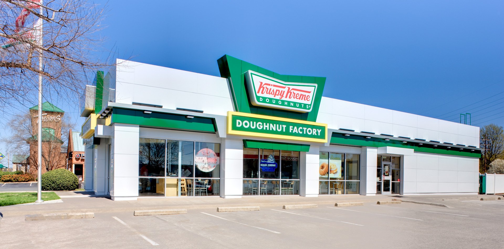
After being vetted in focus groups, the final design was tested on Krispy Kreme's flagship store, located close to the brand's corporate headquarters. This particular location was originally an old brick design topped with a green band that left a forgettable impression.
The structure was "re-skinned" with modular metal panels that recreated the 1950's vintage feel at minimal expense. The result provided a proof of concept that offered franchisees tangible evidence of the new exterior design's viability.
-
Going forward, Krispy Kreme had a branded architectural system that was flexible enough to respond to the specific demands of individual franchisees while still carrying forward a consistent, chain-wide familial aesthetic.
Brand Strategy | Retail Environment Architecture & Design


The Design Office’s solution was to create an open, bright environment reminiscent of the classic coffee bar shops of earlier times.

Maintaining Krispy Kreme’s core brand colors, the building concepts were white, chrome and glass. A bold green counterform mimicked the bowtie shape of the brand. The goal was to strive for a profile that would be distinguishable as a Krispy Kreme shop even in the hypothetical absence of signage.
Alternate iterations of the concept were created, allowing individual franchisees the liberty to adopt the new architectural standard at a level that accommodated their budget and context. This customization was possible while still maintaining a consistent brand story and profile.


Going forward, Krispy Kreme had a branded architectural system that was flexible enough to respond to the specific demands of individual franchisees while still carrying forward a consistent, chain-wide familial aesthetic.