
Book Ferret
Book Ferret is a refuge for bibliophiles, a charming escape for lovers of the written word. It is that rarest of rarities: a classic, brick-and-mortar bookstore just around the corner in the Age of Amazon. Its quiet bookshelves provide a warm refuge for avid readers who prefer pursuing their bibliophilia in person and pixel-free.
-
Book Ferret is the passion project of a pair of enthusiasts for the printed word — finally acting on a life long dream. With a warm and inviting collection of new and gently used books, Book Ferret offers an alternative to online behemoths where customers can rediscover the joys of holding an actual book in your hands.
-
The owners of Book Ferret were taking on a goal that some might characterize as wishful thinking. In a perpetually online, visual culture that seems less enamored with the written word than ever, even the big box industry players like Barnes & Nobles seem to struggle. The premise that a local, "Mom & Pop" venture in such a landscape might seem chimerical to most.
-
The Design Office of John Murph's strategy was to invoke nostalgia with an appeal to the tactile, warm character of the classic corner book store. The brand story would be presented with a Victorian flair that eschewed the impersonality of industry behemoths. Both the visuals and the language would remind Book Ferret's audience that nothing replaces the sound of turning pages, the smell of fresh ink, and the crack of a book spine.
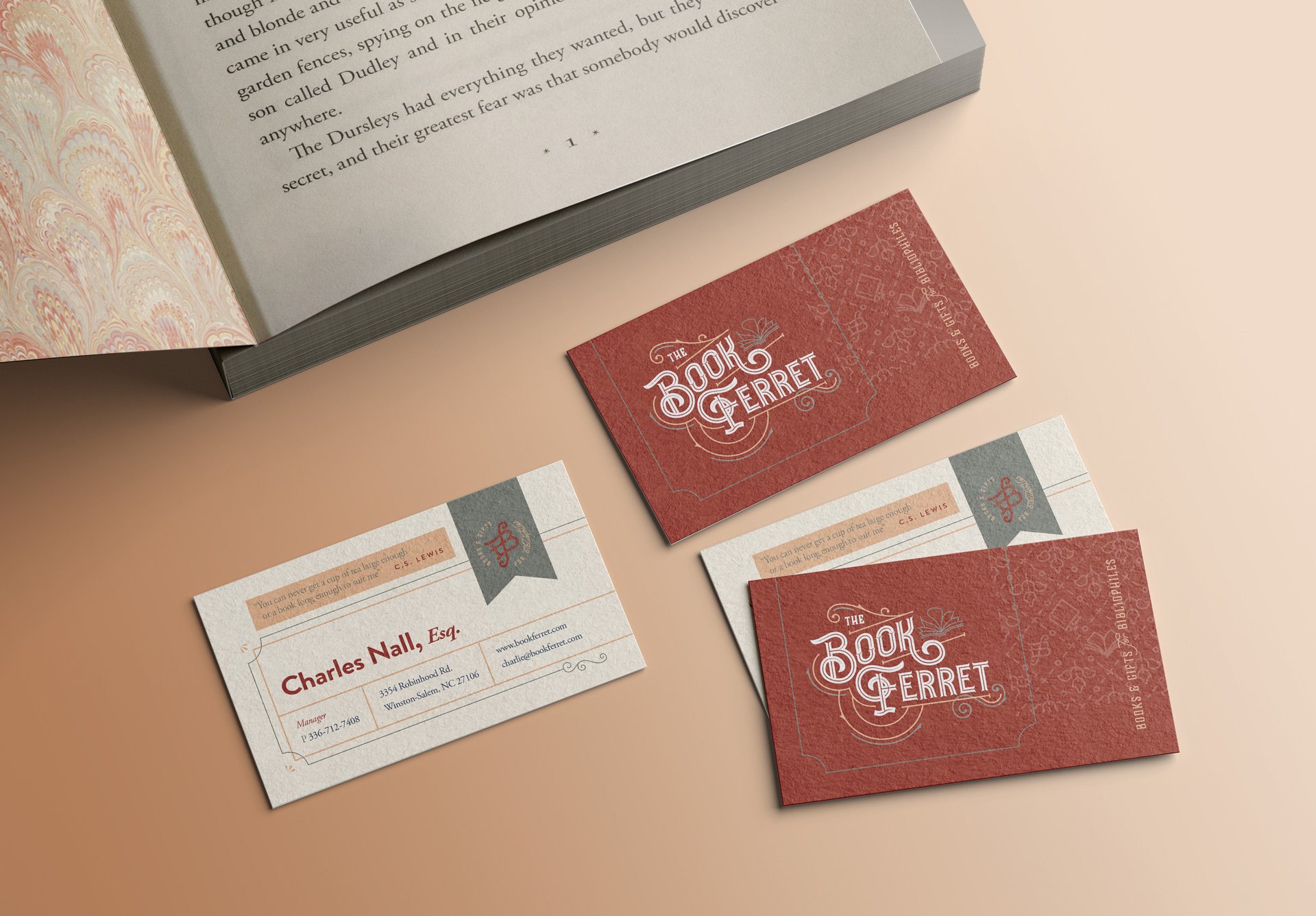
Once delineated, the new brand would be applied to a core website, in-store and exterior signage, collectible gifts, and promotional materials.
-
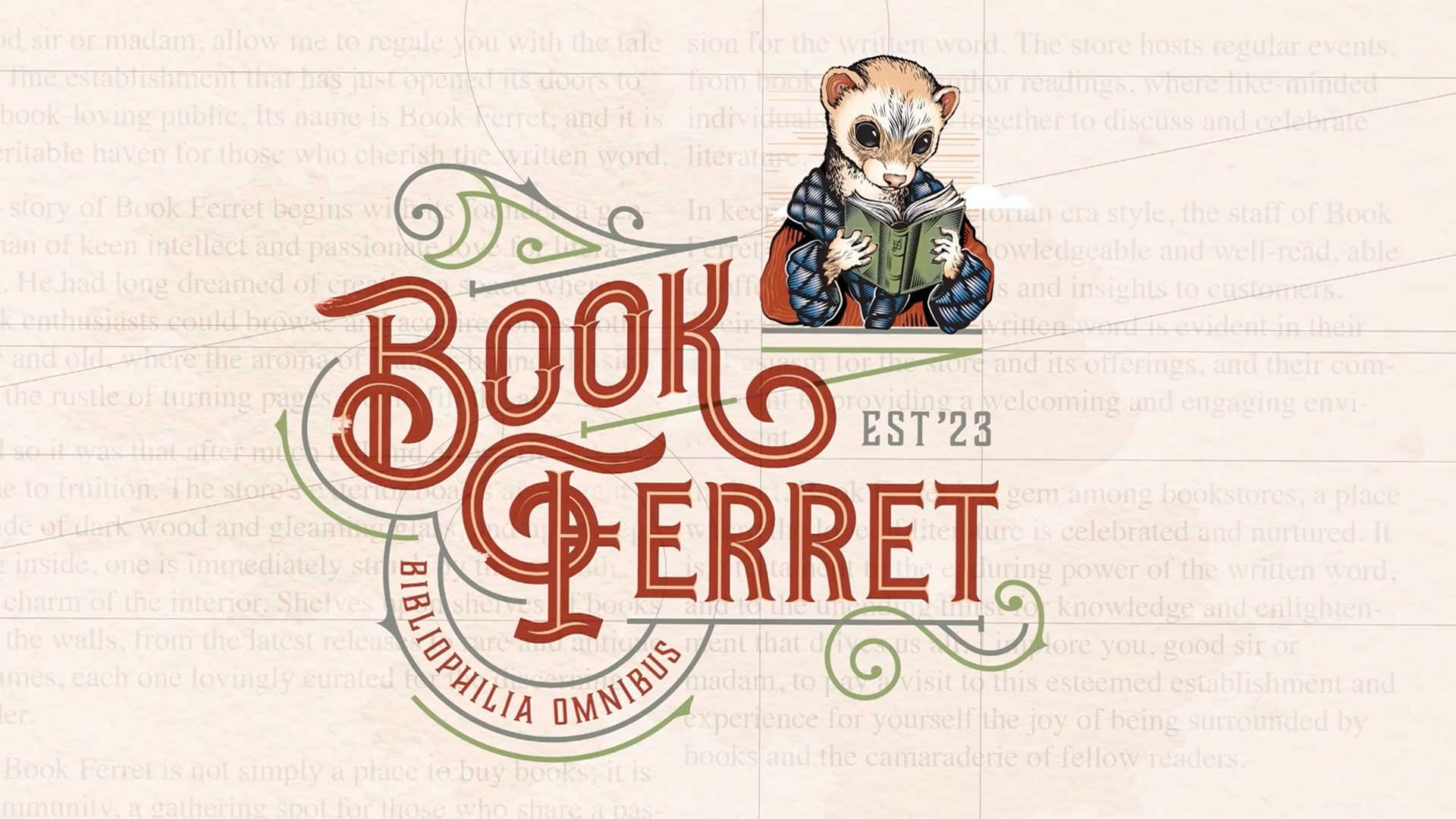
Based on a whimsical illustration provided by the client, The Design Office developed an avatar character named Phineas the Ferret. This mascot embodied the brand with a comfy smoking jacket and a bright-eyed enthusiasm.
A brand voice was also cultivated in tandem with this manifestation, with a decidedly Victorian flair and turn of phrase. Phineas's bibliophilic embodiment was paired with a warm color palette, vintage ornamentation, and lyrical Victorian typography to create the sense of refuge and escape for avid bookworms.
A primary tagline was also developed that deployed a modified version of an old idiom: "Leave No Page Unturned."
-
The Book Ferret brand position was summarized in a colorful preamble introduction that set the tone for the rest of the brand:
"Welcome one and welcome all, bibliophiles of every age, to Book Ferret - a veritable and voluminous repository of prose in print. If you pine at the thought of well-worn books, at the smell of ink and paper, or at the sight of leather-bound spines stacked to the rafters, then our humble bibliotheca will offer you a modicum of refuge from the hurly burly bustle of the digital world.
As a purveyor of the written word and spine-bound circumspection, Book Ferret offers an alternative to warehouse-sized bazaars and impersonal online behemoths. We understand the irreplaceable appeal of a book in hand and the personal, intimate sound of a turning page. That’s why we hold fast to the time-honored tradition of bartering in honest, tangible, bona fide books.
So by all means, dawdle and linger as you trace a finger across title after title. Who knows what treasures you may find? At Book Ferret, your quest has just begun. Leave no page unturned."
-
Despite the odds facing any book retailer, Book Ferret has stood its ground since being founded in 2023. The brand identity developed by The Design Office of John Murph complements Book Ferret's personal touch with customers. In addition to on-site, personal service, the store maintains a ledger of individualized watchlists for customers (at their invitation), letting them know of any developments or new work being published by favorite authors or preferred categories. In addition, the store hosts regular events where readers can connect in person with favorite local authors. It's an exclusive relationship not possible with big box retailers or online alternatives.
Brand Strategy | Copywriting | Logo | Print | Website Design | Signage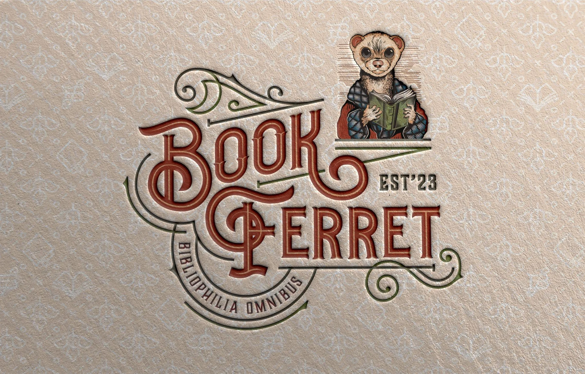


The Client came to the table with the whimsical name of “Book Ferret” as an ownable moniker that announces the product focus and adds a personification of the idea of “ferreting” out a treasured find among the book stacks.
Using this, along with an illustration of a smoking jacket-clad ferret enjoying a leather-bound book, led the Design Office to target a particular aesthetic when developing a brand strategy. It seemed a natural fit.
The familiar ornamentality of Victorian era typography and design instinctively aligns with the subject matter of books and bibliophilia, as well as stately smoking jacket couture.
The Victorian genre provides a vast library of style and methodology that can be mined for an appropriate brand presentation.


Using the original, whimsical illustration provided by the client, The Design Office developed a line-engraved avatar character named Phineas the Ferret. This mascot embodied the brand with a comfy smoking jacket and a bright-eyed enthusiasm.
A brand voice was also cultivated in tandem with this manifestation, with a decidedly Victorian flare and turn of phrase.


